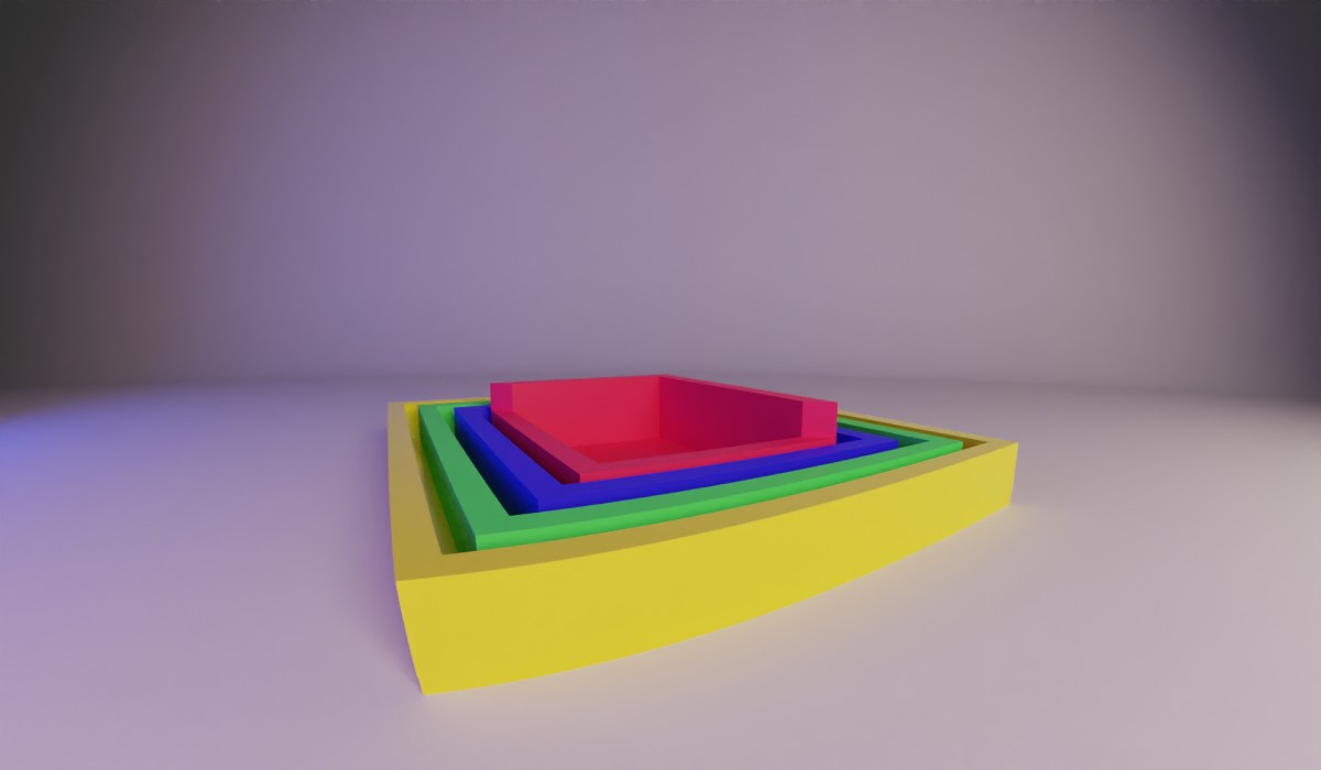
Continuing my series of posts about the box model, we are going to explore the innermost box, the content-box.
The content-box is the most manipulated yet overlooked component of the box model. Here is where your images and text are displayed. But, what really goes on in this most inner box?
When you set a width or height on a block element, you are really applying that to the content box. That is, if you have no padding and no border, when you set the width or height to 200px it scales the respective content area to 200px.
You can set the width and height with just about every unit available. The only caveat is that when you put the height of an element in percentages, it will not calculate it unless its parent has a defined height. It can’t calculate 100% of [undefined].
An example of acceptable values can be found on MDN. I’ve provided a couple of examples below.
    width: 100px; /* set to 100px */
    width: 20em; /* set to 20 times the container's font size */
    width: 50%; /* set to 50% of the container */
    width: 15rem; /* set to 15 times the base font size */
    width: auto; /* the default set width */
Box-Sizing
Content-box
The size of an element and it’s content starts to get confusing when you start to add padding or border to it. By default, the web is set to have box-sizing: content-box; so when you size a box it starts at the content and goes out. For example, if you have a box that has these properties:
   width: 50px;
   padding-left: 10px;
   padding-right: 10px;
   border: 5px solid black;
This would make sure the content area is set to be 50px wide and then add on the padding and border to that and then render the box. This would end up making our box 80px wide after we add the width, left and right padding, and the border.
This is rough because if we set that width to be 50px then it’s a weird 80px wide. Picture it like a room in a house, when you measure the footage for a carpet you don’t include the thickness of the walls or the outside wall. However, when you are outside the house and you measure from one side to the other you would include all that.
As developers we typically don’t want to subtract the padding and border from our width in order to make it a certain size, like this example to get a 50px wide element:
   width: 20px;
   padding-left: 10px;
   padding-right: 10px;
   border: 5px solid black;
We want to make the width of the box a set value and have it stay that way. Luckily there is another value for box-sizing called border-box.
Border-box
When we set an element to have box-sizing: border-box it then starts our width calculation at the border and squeezes in the content-box to allow it to happen.
Having a predictable size makes it so when I set up my 50%/50% layout it stays half and half
So now if we have the width to 50px and add 10px padding to the left and right, it will leave the final width at 50px and shrink the content to 30px. If we continue to add that 5px border, the content would then be squeezed again by 10 more pixels for a final content size of 20px. It will continue to squeeze until the content gets to 0, after that it will start to push out the padding and border to accommodate the values. It will never make the content area less than 0.
Having this capability makes setting up layouts a whole lot simpler. Having a predictable size makes it so when I set up my 50%/50% layout it stays half and half, no matter what kind of padding or border I put on them.
This is my preferred way to have my CSS work. It just makes sense to me that when I set a width, I will see that width on the page. I often refer to my blog post about inheritance on how to set this up on projects.
For the most part, even though there is a lot that goes into the content area, it still is a set-it-and-forget-it attribute. You’ll only need to really think about it when things go awry. Setting things to border-box instead of content-box will typically rectify these issues. Come back next time as I go into the next part of the box model, padding. That’s all for now.