
I’ve always enjoyed reading columns on websites and articles in newspapers and magazines. However, the variable nature of screens makes using columns on the web inadvisable for seamless reading experiences. First, they follow an N pattern rather than a Z pattern, which complicates scrolling and disrupts reading flow. That makes it almost impossible to read when you have to scroll to the bottom of each column and then back to the top to continue reading. There is a case that this could work better for the F pattern as it allows a user to scan deeper into the article quickly. To address the problem of scrolling up and down the N pattern we are going to need to adjust the content to react accordingly to the screen size. Granted, this is lost on mobile devices since they are pretty much a single column as it is and that is probably more than 50% of your traffic. That doesn’t mean that offering a richer experience for desktop users isn’t something to be desired.
With the integration of block editors in WordPress and other site builders, managing multi-column layouts has become more accessible. Up front, I know the idea of mixing columned and non-columned sections may seem disjointed and distracting.
TL:DR
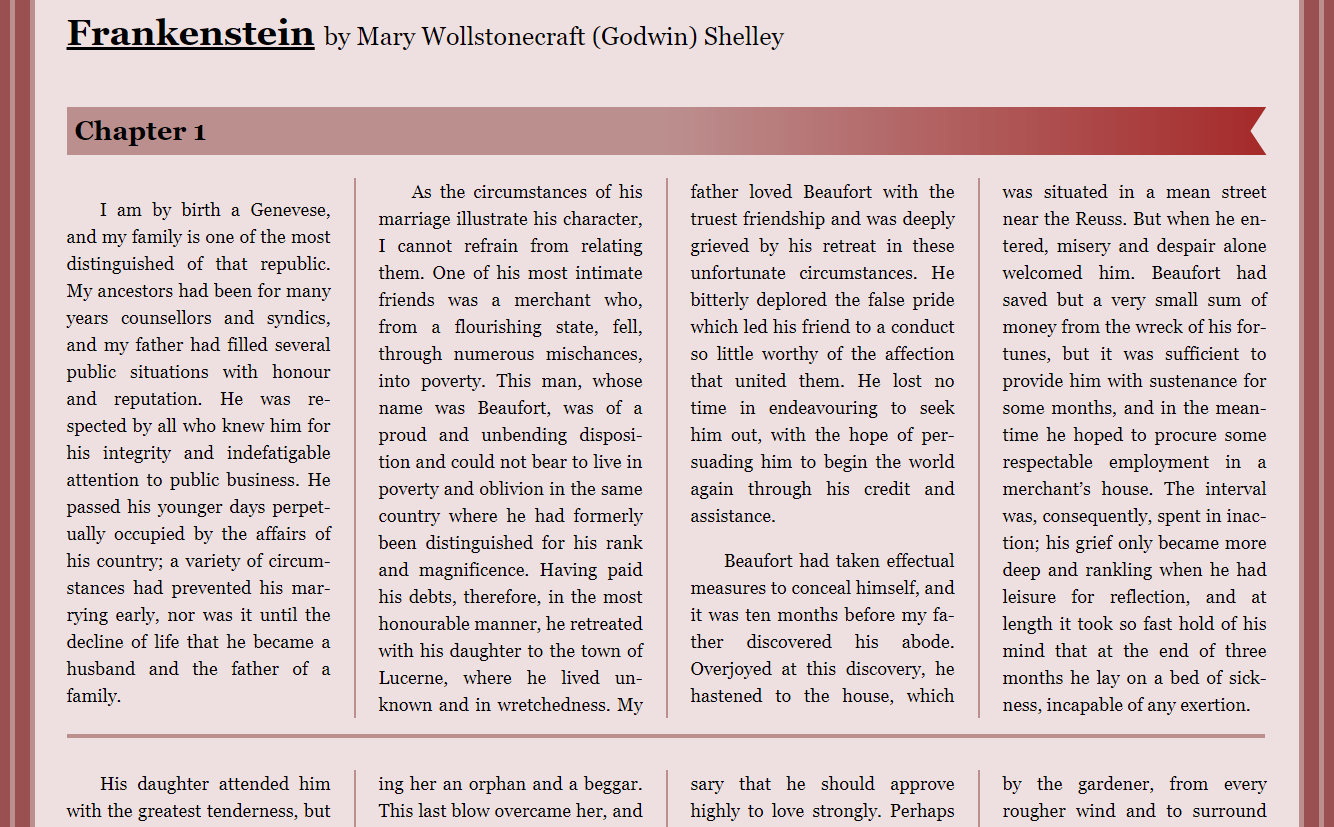
Explore this CodePen for practical examples discussed in this article. It’s an older resource but packed with insightful elements. It is older as of this writing but it has a lot of cool bits to it. This example was one I created for a mock-up of a magazine article and highlights what It could look like with different sections on the page. Or this example that uses a little bit of JS to break up columns and make sure they are readable no matter the screen size, and personally is my favorite.
Column Basics
The basic setup for creating columns is simple. .foo { columns: 2} this sets the column-count and bam, two columns. Another way to set them up it to specify the column-width .foo { columns: 100px } this will make as many columns as it can with them all being 100px wide. So if you had .foo { columns: 200px } when the window was 800px wide you’d have 4 columns, but when it gets down to 400px it would have two, three in-between those two and one when it gets down to 200px. And if you set your column to .foo { columns: 200px 3 } it will max out at three columns. You’ll likely want to set both values so your columns don’t get out of hand, but you’ll almost always want to set a column-width so it can act responsively to the browser. The way the text flows into itself so well its like water getting pulled into a pond, the only thing that acts like this is the now abandoned css regions.
Column-gap and column-rule
Now we can also control the gap between the columns with column-gap , by default its value is normal but we can specify it to any unit we’d like. For example .foo { column-gap: 20px }
We can also add a line down the middle just like a border using column-rule so for example we can set .foo { column-rule: 4px dashed #737215 } unlike borders tho, the rule will not take up any space or move content, to make sure your rule has enough room you need to increase the gap.
Spanning columns
There is a handy feature I learned while writing this article at MDN. You can use while creating content in columns, if you want a piece of content to break them up you can add a CSS property called column-span . The only caveat is that is an all-or-none rule, you can’t have it span only half the columns like you can with tables. .bar { column-span: all } keep in mind it’ll be read as it is laid out in the content so it is not all that great for accessibility. And is the key I discovered while writing this blog to create my JS fix to make columns viable in browsers.
Column Breakups
So now we can create our columns and get them looking snazzy. The next part is worrying about our content when it gets moved to the next column. For instance, if we had a blockquote that spanned two columns, we’d want that to stay in one or the other, not get sliced between the two.
Maintain content integrity when transitioning between columns. Use break-inside: avoid for elements like blockquote, ensuring content remains cohesive and avoids awkward breaks. Other than that, we have break-before and break-after and these will determine breaks before or after elements and take the same arguments as break-inside;
Orphans and Widows
The last part that we need to worry about with these breaks is orphans and widows. These can cause a jarring effect when a single word is located in the next column (orphans). Or if a paragraph starts with a word or two and the rest is on the next page (widow). Setting these to 3 usually is enough, but you can play with it as you like. .foo p { orphans: 3; widows: 3 }This will ensure that at least 3 lines at the beginning and end of the paragraph will be visible in any column. Just be aware both of these are unsupported in Firefox.
Hyphens
Enhance readability with hyphenation in text. Learn more about hyphen usage in my article on Hyphens on the Web, coupled with text-align: justified for natural and visually appealing text layout.
My solutions
Collapse the columns
My original solution was to query the height of the entire section that was in columns, if it was taller than the window, remove the columns. This would work great in a scenario where you can fully control what sections are columned and how often they are spread out. So if a user comes in outside of your typical screen range, they can still have a pleasant experience.
Spanning the column
After I discovered the span-column: all attribute I was inspired to apply that to an::after pseudo-element. It worked flawlessly. Now, instead of checking the height of the entire section, I can compare a single paragraph. At first, that is what I did and it sort of worked. I needed huge chunks of content to trigger the break.
Then I decided to keep adding the heights of paragraphs until it got too long, then break it. This worked out much better, but they were triggering too often now. So I decided to subtract the height of the window divided by 2 from the sum of the heights and now it looks great. There is some text above and below the breaks, and this is intentional in case a user has a regular mouse that can’t scroll like a trackpad or magic mouse and does chunks at a time. I think that it looks awesome and would love to see this in the wild. Here is the result.
A More Unique Web
Now that columns can come back into the picture and we can make webpages feel more like magazines or newspapers (things people have been reading for generations) I think we can open up the designs to create something beautiful to interact with. With this and the unique flow that CSS regions once held there is the possibility of bringing some joy into web design and development. That’s all for now.